Taming Complexity.
I redesigned P40 Financial’s Salesforce platform so the refunds team could quickly find what they need, instead of digging through cluttered screens.
Ancillary Refund Specialists · NCB Management
The main tool was hard to use.
P40 Financial recovers refunds on car protection products — like GAP, extended warranty, and tire & wheel — for auto lenders and dealerships. Every refund goes through a long, multi-step process inside Salesforce. The default screens showed everything at once, with nothing standing out, and the team handles hundreds of refunds a day.
P40 Financial (Premier Forty Financial, LLC)
Car finance refund recovery
Refund processors & ops team
Sole designer — research through to UI
About 2 months
Built inside Salesforce · Figma, UX Pilot, Relume
Everything was on screen, but nothing stood out.
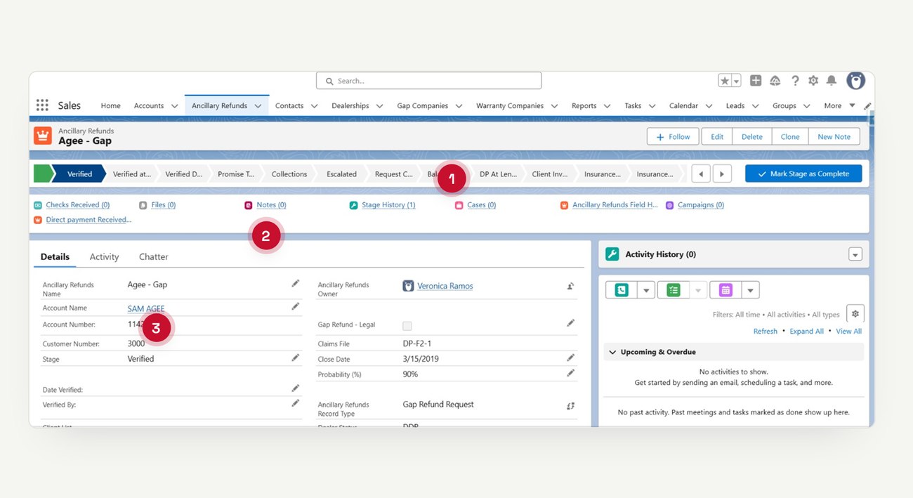
Salesforce shows a lot by default, and that was the issue — a minor field and the one piece of information the team actually needed were given the same weight.
Nothing stood out
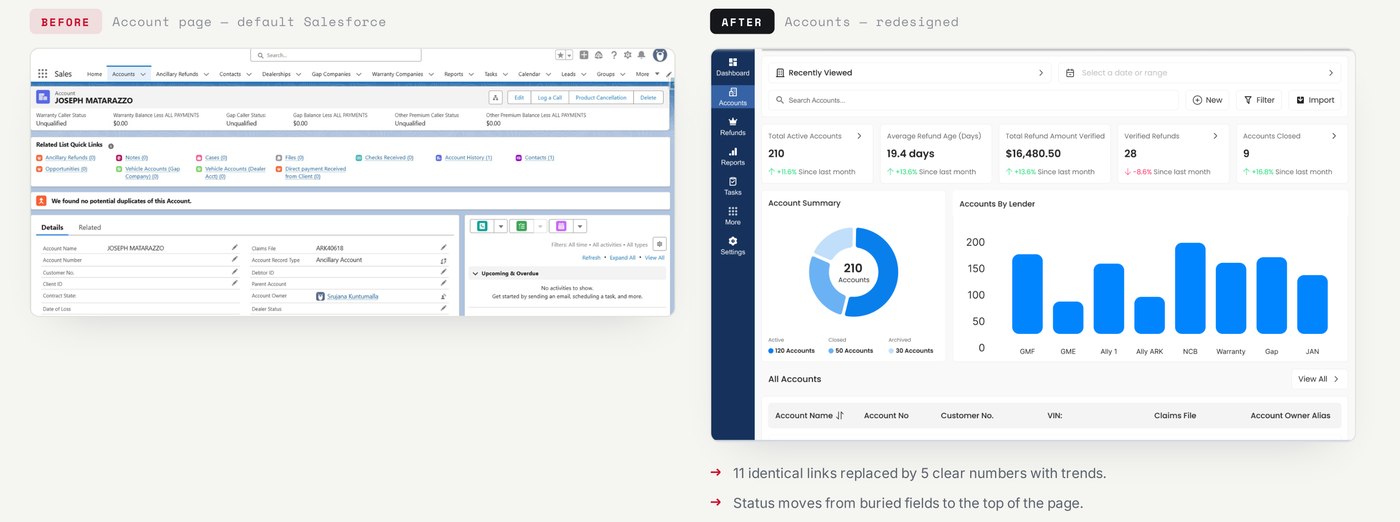
Each screen had up to eleven links and six similar status fields, all looking equally important.
Important data was cut off
Daily lists had 50+ rows with columns cut short, hiding the dealership, owner, and claim details people needed.
Status was hard to find
Each refund moved through twelve stages, but the progress bar ran off the edge of the screen.
How a refund works
Before designing any screens, I mapped the whole refund process with the team. This map shaped the navigation — each menu item matches a real part of the process.
Start eligible
- Customer buys a carFinances the car, adds GAP, warranty, or tire & wheel cover.
- Loan ends earlyPayoff, repossession, or total loss makes cover refundable.
- Create refund caseA new case tracks the refund being claimed.
Process recover
- New account, if neededNew lenders or dealers are set up as an account.
- Link related recordsVehicle, dealership, provider, and contacts linked to the case.
- Submit & follow upSent to the provider, then tracked until they reply.
Close & report
- Payment receivedProvider approves and pays; recorded against the case.
- Case closureRecords checked, payment linked, case marked closed.
- Reporting & analyticsClosed cases feed performance & compliance reports.
Four simple rules I followed.
I turned the problems into four clear rules. Every screen that follows uses at least one of them.
01 · Show status first
Start with the summary, then the detail. Each section opens with key numbers before showing any single record.
02 · Show less, then more
Start with an overview and let people drill in for detail, instead of showing everything at once.
03 · Easy to scan
Show the few fields that decide the next step. Replace dense, cut-off tables with clear, grouped rows.
04 · One consistent system
Reuse the same cards, numbers, and navigation across every screen, so learning one screen means you know them all.
Three main changes.
Rebuild the navigation
Crowded top tabs → a fixed left menu that follows the process. Accounts, Refunds, Dealerships, Gap & Warranty Companies, Tasks, Reports — each item is a real part of the refund process, not a random tab.
Add a dashboard view
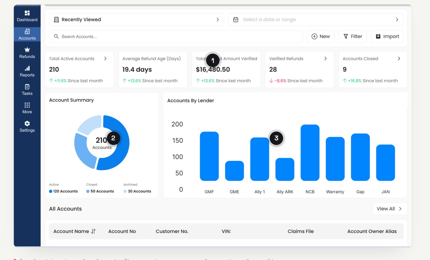
Straight to a list → key numbers and charts first. Each section now opens with an overview — totals, trends, and a breakdown — before opening any single record.
Redesign the lists
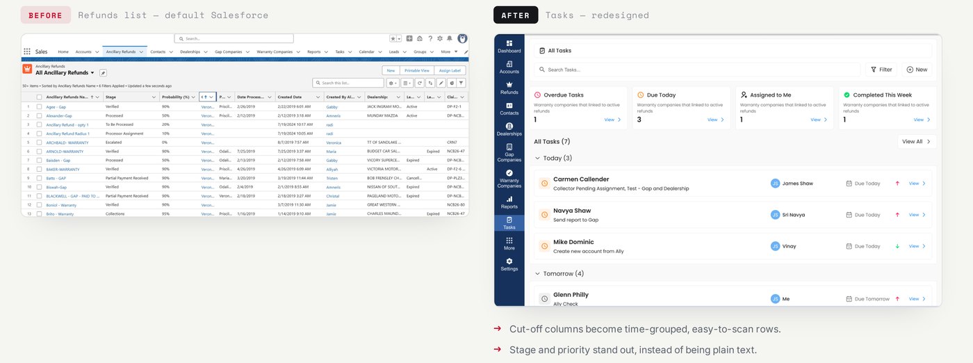
50+ cut-off rows → grouped, easy-to-scan rows. Lists are grouped by time and show owner, priority, and status clearly, so people sort by scanning, not reading every cell.
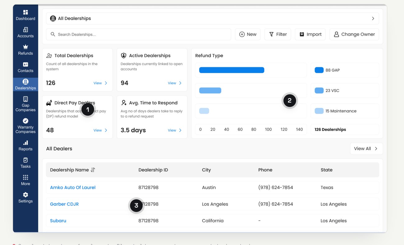
Dealerships, with metrics
New, useful metrics — total and active dealerships, direct-pay count, and average response time — plus refund types at a glance, and the same data in a calm, sortable table.
From a wall of links to a clear overview
From 50 cut-off rows to a list you can scan
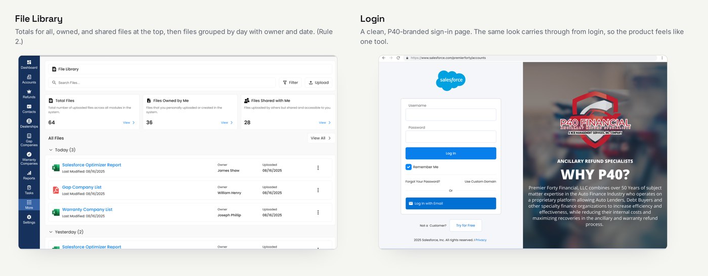
One consistent system
The same look carries through every screen — including the file library and a clean, P40-branded sign-in — so the product feels like one tool, not a patchwork of Salesforce defaults.
Designed to make every refund faster to handle.
I was the only designer on this two-month project. The goal wasn’t a flashy number — it was to organise a daily task around how the team actually works, and give P40 a system it can build on.
Less mental effort
Showing status first means fewer fields to scan to see where a case stands.
Faster sorting
Lists grouped by time let the team prioritise by scanning instead of reading every row.
A reusable system
The same cards, numbers, and navigation across screens are easier to use and to extend.
Matches the workflow
The navigation follows the real refund process, so the tool fits how work actually flows.
These are the intended benefits — the next step is to test them with the people who use the tool.
What I’d test next
- Usability testingWith the team, to measure time and errors.
- Clean up placeholder dataAnd fields, before hand-off.
- Accessibility & density checkFor all-day use.
Thank you.
Taming complexity, one screen at a time.